

By Daniel Timms
Metro Dynamics launches new interactive dashboard on local economic growth since 2008
Today’s events, as we are repeatedly told, are unprecedented. No-one can say with confidence how this pandemic will pan out, in terms of duration, severity, and impacts on the wider economy.
Nonetheless, this is a natural point to reflect upon what has happened across the UK since the last economic shock hit in 2008. We have sufficient distance from these events to see not just the immediate impact, but also medium-term ramifications. One thing which becomes clear is that the trajectories different places have taken have been anything but uniform.
Interested to find an effective way of comparing the performance of different local economies, we started gathering data on economic output (measured by Gross Value Added, or GVA) and hours worked in local economies. Hours worked is the purest measure of employment, because it shows us the total quantum of work done. We began by setting everything to 100 in 2008, so we could see what happened next:

Every data point is currently sitting underneath that green dot. To understand what’s happening in places, we used a geography called “NUTS 2 Regions”. These are smaller than the major (NUTS1) regions (e.g. North East, London) but bigger than local authorities. To look for patterns across the country, we have coloured them according to their NUTS 1 regions.
To understand in any year how places were getting on, we added in two sections to show whether a place was either producing less output, or having fewer hours worked, than 2008, and categorised these as orange. Where both were true, there is a red category:

The best place to be, then, is the top right quadrant.
However, we have so far only considered hours worked and output. But how the first gets converted into the second is a key policy topic: productivity. To explore this further, we’ve added a line to show all the possible outcomes where productivity would be the same for a place as it was in 2008.

The blue circle is at point (110, 110). This means a 10% increase in hours worked, and a 10% increase in the value of goods and services produced from 2008. Therefore, it has seen no productivity improvement. The same could be said for every point on the grey line. This allows us to define two more zones:

The best place to be, then, is in the green segment, where more hours are being worked, more productively, to produce a greater value of goods and services.
With a framework laid out, let us look at what happened in 2009.

Unsurprisingly, most places find themselves in the red corner, with less output and hours of work than in 2008. Merseyside, interestingly, is the one part of the country to see a very small increase in output. Note how Outer London South (Wimbledon, Croydon, Orpington) has seen big drops on both measures. As we will see, the area takes a long time to recover from this.
In 2010, the UK economy begins to recover. Leading the charge into the top right quadrant is Cumbria. Devon becomes the first part of the country to take a small step into the green zone.

Move forward another year, and we see Outer London South still languishing in the red zone. Output growth at this stage is most impressive among the two most northerly NUTS 2 regions – Highlands and Islands, and North Eastern Scotland, though in neither is more work being done than in 2008.
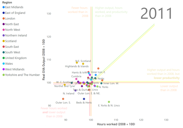
One year later, and we can see the two inner London areas really pushing away from the rest of the pack. It’s important to remember that these dots are each showing a place’s position relative to where it was in 2008. That is, we’re not saying that inner London produced more output than others (which would certainly be true), but that they recovered faster than others. This is especially striking as 43.6% of the UK’s financial and insurance sector by value was concentrated in these two areas in 2008. We might have expected the place where the sector at the heart of the crash was based to struggle most to recover. In fact the opposite is true.

This gives us our first lesson:
1.) The immediate causes of an economic shock are not necessarily closely correlated with the eventual impact.
If we move on to 2013, we can see the two Inner London areas cementing their lead, along with North Eastern Scotland (which is brought down with a bump shortly afterwards following a change in the local oil industry’s fortunes).

But have a look, also, at the bottom left of the chart. Most places have managed to leave the red zone five years after the shock occurred. But two places have not.
The first is Outer London South, still in the worst position at this stage. But Outer London South directly borders the two inner London areas. This brings us to a second lesson:
2.) Proximity to strong economic recovery is no guarantee of recovery.
While many suburban areas will be looking to their urban neighbours to drive recovery, it cannot be taken for granted that this will ripple outwards.
The second place stuck in the red zone is Merseyside, despite being the only place not to fall below 2008 levels in 2009 (something it managed to maintain into 2010 as well). This gives us lesson number three:
3.) Initial resistance does not ensure long term resilience.
While, by the end of the period, Merseyside does move into the green area, it’s a long way behind other parts of the North West (Lancashire, Cheshire, Greater Manchester).
The opposite is also true: consider the example of Bedfordshire and Hertfordshire. In 2012, the area was deep into the red zone, particularly on output. But by 2018, we can see it has pulled off a real resurgence:

Which tells us that:
4.) Initial vulnerability to a shock does not necessarily hinder places long-term.
This should give comfort to those areas which feel they are especially exposed to the current shock.
What other messages come out of the data?
5.) Scotland has struggled to increase hours of work

Though the Scottish areas have taken different trajectories, they have all ended up in more or less the same place. The only places to see a decline in hours across the UK are all in Scotland. This may be to do with an ageing population, or a move towards part-time work.
6.) Recovery has been especially weak in the Humber – Tees area
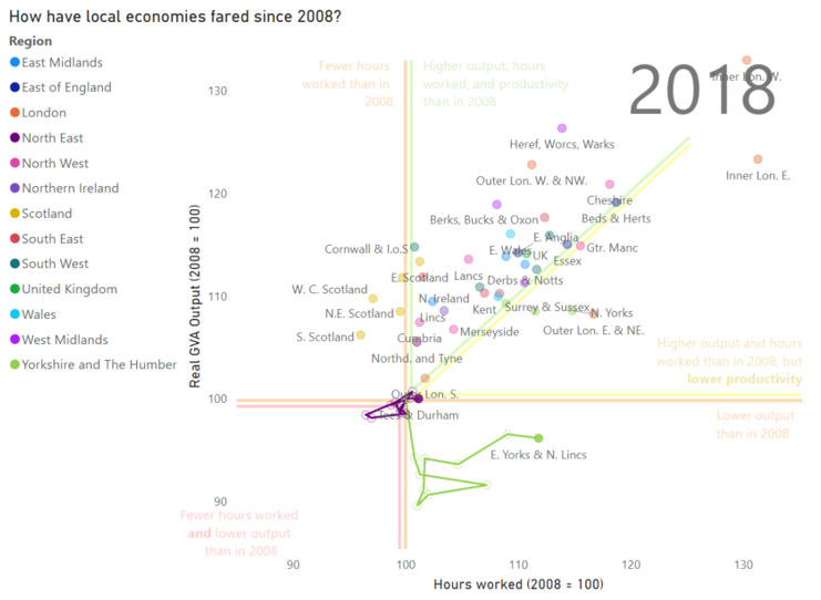
Tees Valley and Durham (purple) has moved very little distance since 2008. The area of biggest concern would have to be East Yorkshire and North Lincolnshire, the only part of the country where output is down (by some way) from 2008. That this has happened while hours have increased looks like a classic gig economy story – more people working in less productive jobs. If levelling up means anything, it surely must start with this part of the country. (In fact, Yorkshire as a whole has had a pretty sluggish recovery, with only South Yorkshire seeing a (very small) productivity improvement.)
7.) London’s performance has been far from uniform
While Outer London West and North West (Edgware, Ealing, Harrow) has seen one of the biggest productivity improvements (10.5%) Outer London East and North East (Enfield, Romford, Woolwich) has had one of the biggest drops (-7.4%). Inner London West (Hampstead, Mayfair, Wandsworth) has seen output growth of over 30%, while Outer London South has barely managed 2%.

What happens next? Tempting as it would be, we have resisted putting projections of future growth onto places – we still don’t know enough about the likely economic impact of this pandemic. Nonetheless, those who want to get a sense of where things are heading could do worse than heed the final lesson from the data:
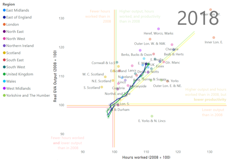
8). East Anglia has been most reflective of the UK as a whole
Over the last ten years, East Anglia (Norfolk, Suffolk, Cambridgeshire – shown in blue) has moved almost perfectly in tandem with the UK (shown in green). This could be a good place to keep an eye on as we look to monitor the economic impacts of this current shock.
The dashboard is available below to explore the data – click play to watch what happens, and click on dots to see how they progress over time (you can multi-select places by either clicking on a region on the left, or using ctrl + click). Hovering over a place will give more information.
The effects of the next shock are uncertain, but there are many ways to be better prepared. If you would like to ask us about supporting you in your coronavirus response, please get in touch at admin@metrodynamics.co.uk
Sources:
ONS (Balanced) GVA by industry - NUTS1, NUTS2 and NUTS3 (chained volume measure)